By Bel Rosenthal
No flat map is a fully accurate map of the world; each expresses a specific perspective and set of priorities. Regardless of whether you care about or pay attention to maps, they have shaped the way we all see the world. Call one to mind; it is a familiar picture — probably brightly colored, with Russia stretched largest across the upper right-hand side, Europe toward the middle, the U.S. most prominent on the left. South America and Africa are smaller and closer together on the bottom, like the kids of two friends awkwardly ushered together, and then there’s Australia off in the corner. Everyone grows up with maps; they are on the walls of school classrooms, in textbooks, used as decoration, on the news, in movies, and more.
The way that we see the world is not objective. Our perspective and our understanding of things are shaped by our cumulative experiences, many of which we cannot pinpoint or remember and that are constantly changing. This is visible through the example of map projections. Due to the challenge of trying to portray a spherical shape onto a flat surface, all world maps are also distorted and, like us, have a distinct perspective. By not addressing this inherent inaccuracy we have grown to see ourselves as reliable judges of “truth.” However, if we choose to reexamine our beliefs, starting with what the world we live in looks like, we can begin to see how perspectives we may or may not agree with, and that we may or may not even be aware are being presented to us, have shaped and influenced our own beliefs and ideas.
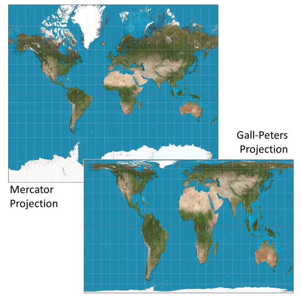
A common comparison used to help people picture the problem presented by trying to transfer the image on a globe to a map is the challenge of peeling an orange so that the peel all comes off in one piece and can be laid flat. It is often in ragged shapes, with disconnected features and little resemblance to what we imagine a holistic map to look like. So, in order to create a cohesive map, the accuracy of some aspects must be sacrificed to allow for accuracy in others. Each of the strategies for doing this is known as a projection or, “a method for taking the curved surface of the earth and displaying it on something flat, like a computer screen or a piece of paper” (“What is”). For example, the land masses and bodies of water closer to the poles could be stretched to maintain lines of latitude and longitude that are as straight as possible. This is done with the Mercator projection (“Mercator,” fig. 1).
The Mercator projection was initially designed for ocean navigation by European explorers and was later used, along with other maps, as a way European colonial powers were able to assert dominance over regions that had not yet mastered geographic mapping (White). Its straight lines made it a very effective tool for ocean navigation, but it is used for other purposes now. It is likely the map you are most familiar with, from its role in most classrooms around the world and even by Google Maps. This, like our own distorted perceptions, is important and sometimes even dangerous because of the ripple-like effect it has on our beliefs and actions. We define much of the rest of the world by its relationship to Europe as the center, e.g., the Middle East or the Western World. The central placement of Europe, on the very map they used to colonize large parts of the rest of the world, reinforces their perspective of colonial superiority and view of their own dominance — and lowers the perceived status of the peripheral regions (Snyder; Wood et al. 90-93).
One of the more popular solutions proposed to address this issue – which was adopted by Boston’s public schools in 2017 (Walters) — is to replace the Mercator projection with one called the Gall-Peters projection (“Mercator,” fig. 1). The Gall-Peters projection gained a lot of attention in the past several years for its more accurate presentation of continental size in comparison to the Mercator. It is seen as an ethical choice for a more balanced view of the world. The fictional “Organization of Cartographers for Social Equality,” that appears in an episode of the TV show West Wing, is frequently referred to as support for this argument (“Somebody’s Going”). The segment’s amusing and easy to follow argument explains many of the problems with the Mercator projection. However, it glosses over the Gall-Peters’ own drawbacks. While the Mercator can feel laughably wrong in that it portrays Africa and Greenland as roughly the same size, when in actuality Greenland is about 14 times smaller (“The True,” fig. 2), the Gall-Peters, in order to present more accurate sizes, distorts many of its shapes and loses directional accuracy. By presenting the replacement of one distorted map with another, they have failed to address the larger issue: that neither is fully accurate and that varied perceptions of truth exist everywhere. The important lesson to take from inconsistent presentations of information – excluding, of course, actual verifiable facts – is that there may not be a “right” one, each shows a slightly different truth, and the best way to get a full picture is to view a variety of different perspectives with that awareness in mind.
Studies on implicit bias, summarized by the Kirwan Institute, also concluded that the beliefs we hold, specifically those that we are not aware of, have a real and measurable effect on how we think and act. They define implicit bias as, “the attitudes or stereotypes that affect our understanding, actions, and decisions in an unconscious manner.” They looked at implicit bias through its connection to racial inequities and found that these subconscious beliefs led pediatricians to be more likely to prescribe painkillers to white patients than black patients and that, even when controlling for a number of other factors, they resulted in people with more prominently African-looking features receiving longer prison sentences. They also state that these views do not necessarily align with the ones that we consciously hold, meaning that we are not at fault for acquiring these biases, but also that they are worth recognizing and challenging. Even more hopefully, they assert that we have the ability to reshape and unlearn them (“Understanding”).
My own interest in the way choices made on maps impact our worldview was sparked when I was 11 years old and came across a map on the wall of a restaurant near the southern tip of South America (“The World,” fig. 3). It depicted the Southern Hemisphere on the top half of the map and the Northern Hemisphere on the bottom. I was confused and intrigued by this weird “upside-down” world. After reading the short explanation written across one of the oceans, I realized that simply because Europeans had created the map we use, I had until that moment believed my half of the world to be up. It is clear from the way we speak that we associate up with good and down with bad. Heaven is above us and hell is below; on the ladder of success, that defines America, up is progress and down is chaos. We want to “move up in the world,” sometimes we “feel down,” and we strive to be better than or “above” something. Whether or not we consciously recognize, by being placed on the top, we get to feel superior to those on the bottom. This realization did not feel frustrating or make me angry, though; it was an exciting revelation. Being faced with facts that challenge what you believe can be scary, but it can also allow us to better understand our own perspectives and better communicate with others.
Just because the information we receive is somewhat subjective, that does not mean that it is worthless. Take the example of op-eds; these opinion pieces are inherently subjective, but we still read them. They are published by newspapers and scholarly journals. They introduce us to new perspectives, inform us about relevant issues, and can present nuanced views and reliable information. As you now know, the maps you have seen of the world are also not entirely objective. However, through them you can gain an understanding of where you stand in the world, what our planet generally looks like, and how to get to the closest Chipotle, but also how parts of the world view each other. English professors have likely counseled you to think about the position behind what you are reading with questions like: who is the author, what audience are they trying to reach, what might they be trying to accomplish, and who might that benefit. This works for maps too, and is what the authors of Seeing Through Maps, encourage us to do when seeking a map that suits our needs. They propose the questions, “What can I discern about the self-interest of the mapmaker and/or those who commissioned the work? How do you suppose that self-interest or agenda may have influenced choices of what to include or omit?” (Wood et al. 12). By examining the perspective behind a map or opinion piece, what is prioritized or emphasized and what is sacrificed or sidelined, you are more able to understand the perspective and bias it reflects. From there it is up to you to decide what you do with your source. For a map, maybe think about whether its priorities match what you are using it for. For an op-ed, let it inform your sense of its reliability; learn what it teaches you about the subject, and about the author. Rather than being less useful than an objective source, a subjective source can actually provide you with more information than a direct statement of fact. These questions can be a way to look at any perspective-influenced information you receive, and most information is influenced by perspective in one way or another. If you imagine the subject of your source as the scene in a photograph and the perspective as the photographer, it is clear that knowledge of the photographer increases your understanding of the photo and analysis of the photo increases your understanding of the person who took it.
Works Cited
“Mercator Projection and Gall-Peters Projection.” Mapping, Society, and Technology, University of Minnesota Libraries, https://open.lib.umn.edu/mapping/chapter/7-lying-with-maps/#footnote-402-1.
“Understanding Implicit Bias.” Kirwan Institute for the Study of Race and Ethnicity, 2015, http://kirwaninstitute.osu.edu/research/understanding-implicit-bias/.
Snyder, John P. Flattening the Earth: Two Thousand Years of Map Projections. University of Chicago Press, 1993.
“Somebody’s Going to Emergency, Somebody’s Going to Jail.” The West Wing, season 2 episode 16, NBC, 28 February 2001, https://www.youtube.com/watch?v=vVX-PrBRtTY.
“The True True Size of Africa.” The Economist, 10 November 2010, https://www.economist.com/graphic-detail/2010/11/10/the-true-true-size-of-africa.
Walters, Joanna. “Boston Public Schools Map Switch Aims to Amend 500 Years of Distortion.” The Guardian, 23 March 2017, https://www.theguardian.com/education/2017/mar/19/boston-public-schools-world-map-mercator-peters-projection.
“What is a Map Projection?” Caliper Mapping and Transportation Glossary, https://www.caliper.com/glossary/what-is-a-map-projection.htm.
White, Nathan. “Geography and Empire.” Postcolonial Studies @ Emory, October 2017, https://scholarblogs.emory.edu/postcolonialstudies/2014/06/20/geography-and-empire/.
Wood, Denis, Kaiser, Ward L., and Abramms, Bob. Seeing Through Maps: Many Ways to See the World. ODT, Incorporated. 2006.
“The World.” The Upsidedown Map Page, https://www.flourish.org/upsidedownmap/.